CRM Accounts Redesign
Time: 2017
Background
Veeva CRM Suite is a multi-platform customers relationship management platform tailored for global life science industry. I was part of Veeva CRM's product design team working on CRM iPad app redesign from early 2017 to mid 2018. Meanwhile, we also designed the first iPhone app (MVP) with limited but core functionalities. Accounts was part of the initial iPhone scope.
Problem
As the product grew rapidly in the past 10 years, the old design has struggled to scale. Usability problems increased, navigation became a pain for end users (sales reps). There were too many UI patterns in the app that cause confusions.
Challenges
- Legacy -It's challenging to overthrow the heritage. In fact, sunsetting any old features was extremely difficult even if only one or two customers are using it. How might we keep the same functionalities but create a new framework with better user experience?
- It's a complicated system - Veeva CRM is a highly configurable product that contains regulatory requirements and compliances. Any new UI pattern needs to consider all business flows and use cases.
- It takes efforts to talk to end users - The concept of user research was new to many of our customers, the team tried hard to convince buyers (admins) to allow us to talk to end users (sales reps). In the meantime our customer success team helped giving feedback based on their conversation with customers and the PMs shared their insights to help us understand user journey.
- Internationalization - Design with 20+ languages in mind. The new design has to work well in a condensed language like Chinese and in longer text languages like Russian and German.
Goal
- Create a new UI framework to streamline navigation patterns and enhance discoverability.
- Redefine visual styles and elements to build a new design system.
- Re-organize and enhance features with a clear UI hierarchy to bring the balance between complexity and simplicity.
- Streamline the process to accomplish tasks (navigation).
- Enhance views of data.
- Create cohesive styles and patterns across platforms.

My Work with Accounts

Accounts was the first app area I explored the new framework with, since Accounts is part of the core features as well as it shares similarities with many other app areas. In parallel I started working on the Accounts in iPhone app.
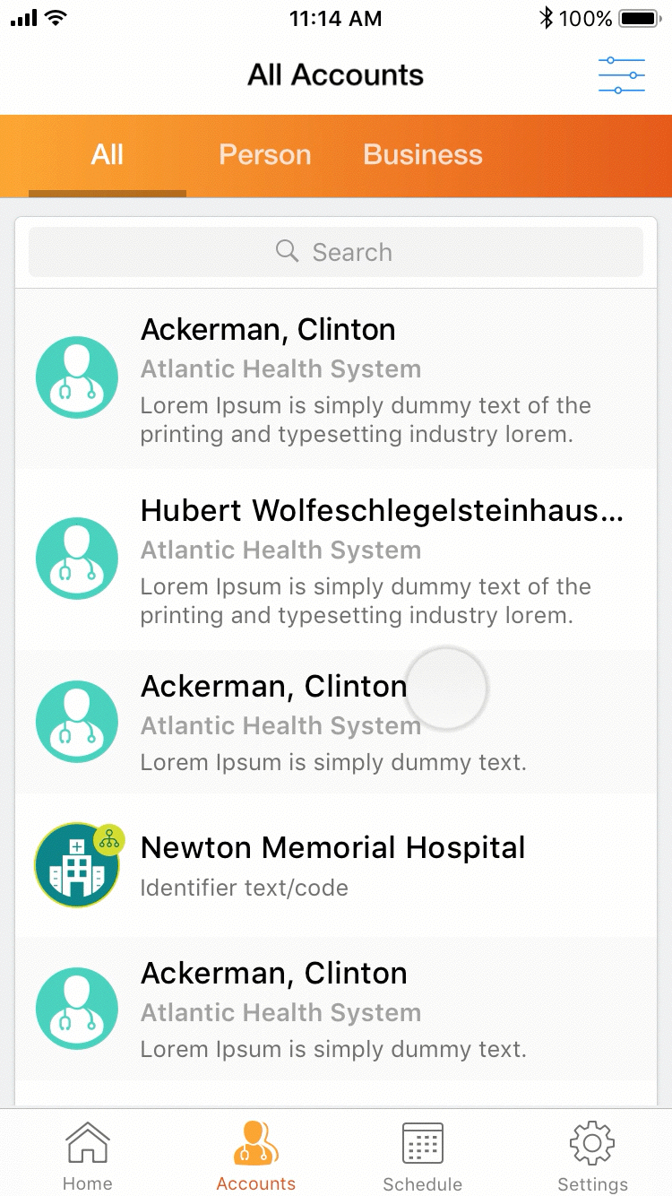
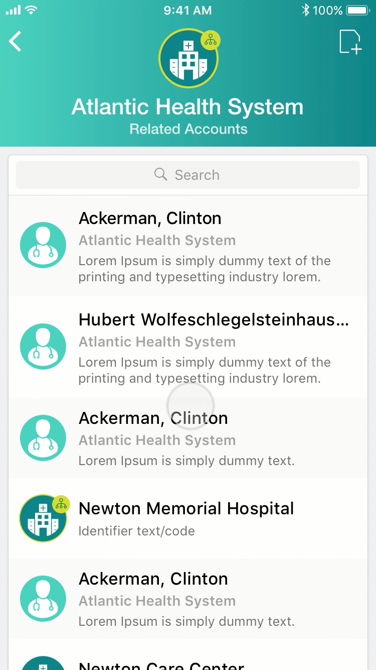
Accounts allows users to view, search and filter a list of aligned healthcare practitioners and organizations with detailed profile information. Users can perform actions against their accounts such as report a Call, send emails or send samples.

The old UI layout misused the native iOS split view and caused navigational problems. It also took 1/3 of screen real estate that customers complained. Instead of a hamburger menu we decided to use the native iOS tab bar as it's more discoverable and faster to access the important tabs.


The finalized layout is the foundation of the CRM Sunrise redesign. Critical page actions are on the right side of top nav bar, such as Edit, Create a Call. Sunrise Bar may contain configurable tabs to switch views like List View, Map View. In content area there might be actions based on Sunrise Bar views and these actions are placed on top of the content card.
Usability Testing

In December 2017, the team performed two user testing sessions with the new Accounts design prototype. The purpose of the usability test was to test out the general navigation, patterns and to find out whether the new UI elements were understandable.
Below are a few main research questions:
- Is the overall navigation making sense? Can people find things quickly?
- Do people understand the meanings of new icons?
- Is the new design making the tasks easier to complete?
What We Learned
The overall feedback from user testing sessions was positive. Users complimented the new UI is modern and clean, the content is richer, some old features got improved and they found it easier to use. We also found users were open to changes that make their jobs easier, versus their IT managers pushed back more on new things to avoid additional training efforts.
We also realized there were two typical user types and they reacted differently:
- People (tend to be younger ages) who understand native iOS behaviors and modern technologies. They are faster learners, some of them are pro users who use more complex features.
- People who only use simple basic features. Many of they are middle aged peole who are late adopter of new features, they want the app to be very explicit and simple.
In the final design, I addressed some of the feedback from the later user type by making critical data more prominent, having primary action buttons such as Create a Call redundantly appearing on the top navigation bar and inside the general action list with explicit labels. I also added more visual clues to guide users such as showing an arrow on the Sunrise Bar to indicate scroll to see more.
Final Design